Northern Liberties Neighbor Association & Liberty Lands
Updated NLNA logo. New logo for Liberty Lands with interlocking Playground logo.
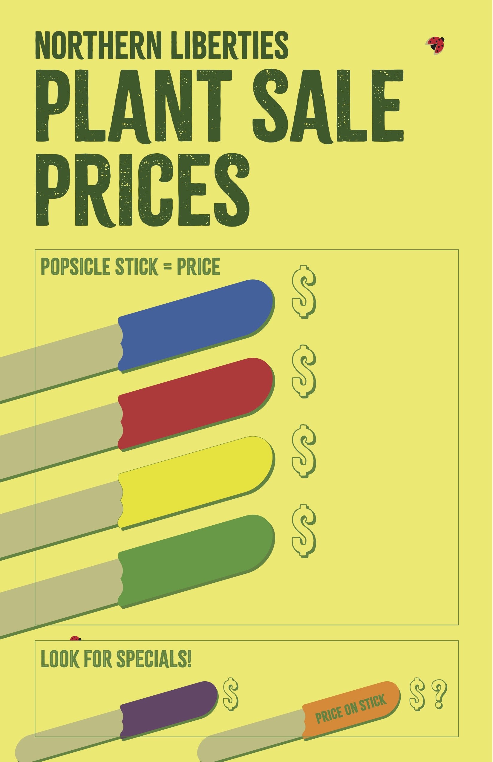
Multiple poster designs created for local events.
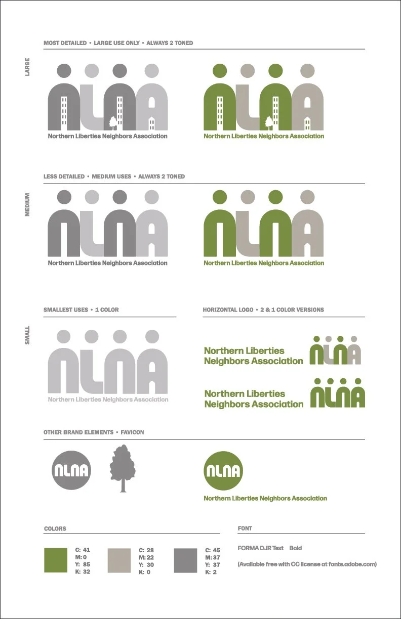


Northern Liberties Neighbor Association
Liberty Lands Signage Campaign


One of the premier parks in Philadelphia, Liberty Lands is completely neighbor owned and operated. The park has evolved since its creation and was long overdue for fresh signs communicating everything from park rules to the potty code. I designed a full color-coded system, created a hierarchy of fonts and design elements, illustrated and typeset each one. The park differentiates itself with its many gardens and rustic feel, the signs are designed to blend in to that feel.
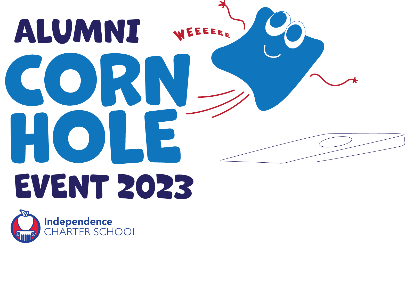
Independence Charter School
Logo Design & Illustration

CRAZY AARON’S
LOGO REDESIGN
before

after
Crazy Aaron’s came to me after consulting with a large design agency who didn’t quite ‘get’ the brand. The old logo, an off the shelf font paired with Aaron’s caricature, changed minimally as the brand grew and was ready for a solid refresh. The new design is steeped in the personality of the company: super creative, fun, and—well—puttyish. I redrew Aaron’s head and fit it into a new fresh logotype.
CRAZY AARON’S
THINKING PUTTY CONCEPT TYPESET AND PACKAGING
Logo System: asymmetrical putty blob. Enters from the left on product tins. Comes in from the right on boxes. Centered version for other uses.
Pattern System. Introduced patterns to help visually differentiate each line of putty.
Designs for tins and boxes. Lots of levels of information to communicate in a fun distinctive package.
BROWN FORMANN FIELD GUIDE TO WHISKEY
BOOK DESIGN
This Field Guide is the primary text accompanying a course to teach Bartenders about the history and details of Whiskey as well as the Brown Formann product line. There are many layers of information that required organizing, hierarchy, and styles to separate the elements into an engaging visual piece. The strong grid became the backdrop to blocks of text, callouts, charts, graphs, maps, tasting notes, and lots of wonderful photography.
ARK SOLAR LIGHT
BRAND IDENTITY

An innovative startup approached me with little more than a name and a hundred ideas. I focused the company to define their brand and identify its strengths: Clean Energy, Flexibility, and Quality. The new logo bursts like the sun with radiant lines conveying motion, juxtaposed with fresh, innovative typography.
SEW CHIC BY YELENA
LOGO & BUSINESS CARD DESIGN
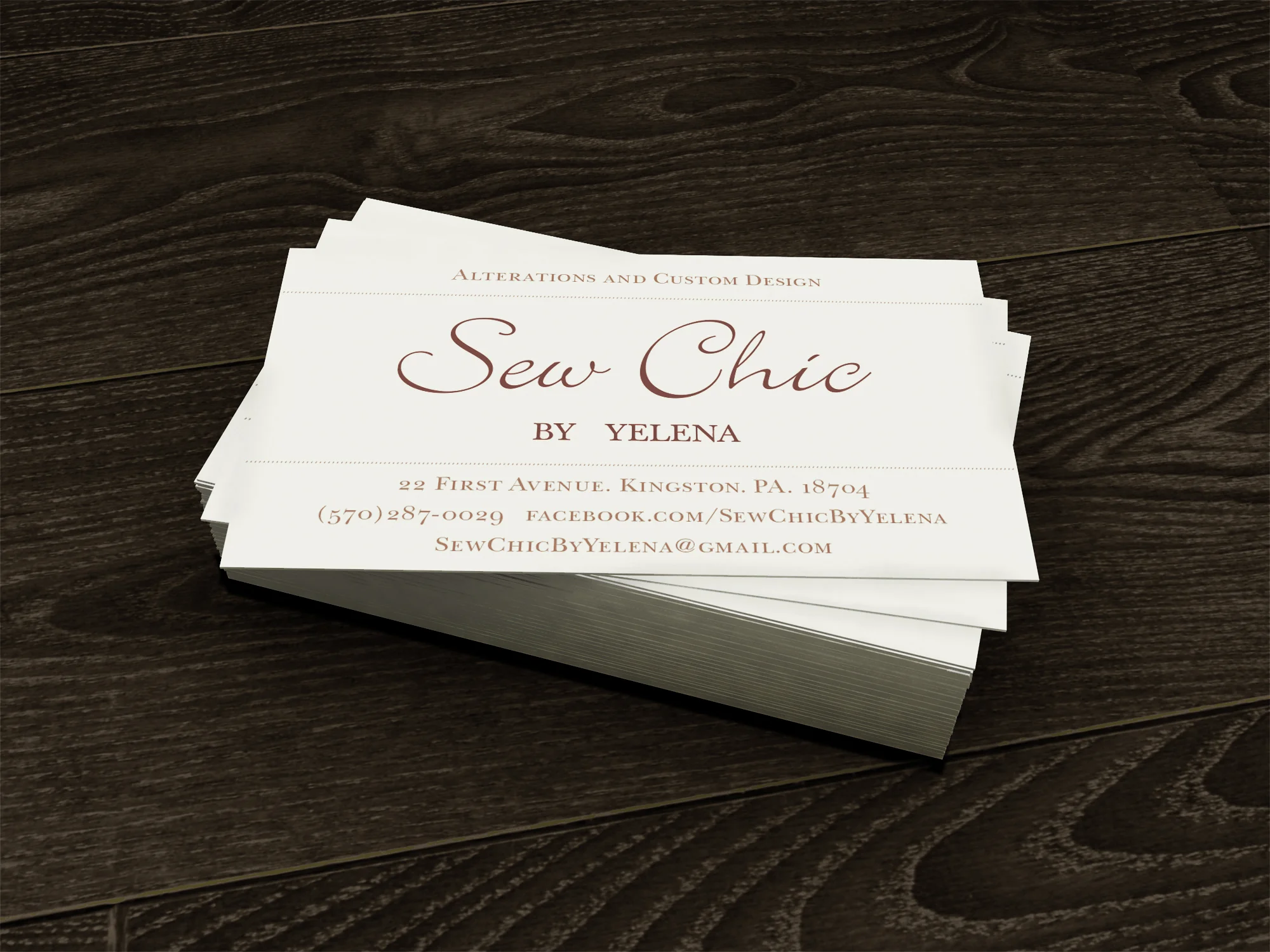
Lively logo and business card for a high end custom dress maker.
LEGO BRAND RETAIL
SUPERHEROES PRIMARY DISPLAY
I developed an engaging display attracting kids and parents alike. As the main point of engagement the actual minifigures stand front and center with large illustrated diecuts at the back of the tubes. The background banner featured DC on one side and MARVEL on the other, flipping halfway through the launch to allow both IP’s equal exposure.
To create an interactive in-store experience, we encouraged customers to pose with 4’ renders of Superhero minifigures placed throughout store.
In-store display utilizes bold color to separate IP’s, with the display cases rotating at refresh alongside the window banner
LEFT: Front window display with real minifigure in front of illustrated minifigure. RIGHT: In-store display using color to differentiate IP's.
LEGO BRAND RETAIL
NINJAGO PRIMARY DISPLAY
Snakes are the big bang for this Ninjago launch; flowing through the product line and TV series, Brand Retail stores created another dimension for this top-seller. Huge snakes hang behind tubes backed with images of green snake skin and filled with built models. At kid height is a massive lenticular ninja head teasing the storyline of Lloyd, the main character, flipping between good and evil.
In-store setup displaying product on carved foam risers, backed by large ninja. Callout highlights special tactile snake skin surface created for all cube wraps.
LEFT: Huge snakes and a ninja head with lenticular eyes. RIGHT: In-store display featuring snake skin texture on cube wraps.
LEGO BRAND RETAIL
MONSTER FIGHTERS PRIMARY DISPLAY
A dynamic interactive window display using pulsating lights inside tubes with a moving zombie arm warning “Look inside... ...if you dare!.” Behind each set of ghost eyes are backlit chase scenes of the Monsters vs Monster Fighters. Unlit tubes display product. Strobing lights effectively pulled shoppers in from a distance.
This full store takeover including a zombie arm reaching out of play brick and ghosts floating along the entire perimeter of store.
The floor display is designed to focus customer attention on the primary play set by creating a life size version of the gate element featured within the set itself.
LEFT: Front window with pulsating lights behind ghost eyes and a moving zombie arm. RIGHT: In-store display.
LEGO BRAND RETAIL
HOIDAY FULL STORE DISPLAY
Brand Retail, aligning with Catalog and Online, created a bright and fresh LEGO Holiday. A special tagline “A HOLIDAY tradition is BUILDING” backed the whole campaign. LEGO snowflakes, branches and trees formed patterns for wrapping paper and ribbon used cross-channel as primary design elements.
Gallery Window features tagline in 3-dimensional sign and permanent fixtures wrapped for the season. Layers of ribbon hang behind tubes filled with built models and white on a white snowflake pattern.
Display cases in-store wrapped in holiday patterns and ribbon. Different height risers boxes allow stores flexibility necessary during high season. Cash Wrap featuring Pick a Brick box atop large Gift With Purchase promotion and large snowflake decals below.

Rockefeller Center - Flagship Store Window. Special LEGO built model surrounded by Holiday graphics.
LEFT and CENTER: Front windows with holiday wrapping paper and ribbon. RIGHT: In-store displays.
LUCASFILM LICENSING STYLE GUIDES
INDIANA JONES & STAR WARS: THE CLONE WARS
The backbone of the licensing program: these style guides provide artwork and set a high standard of design for licensing partners. From concept to mood boards, design in house as well as art directing other artists, these highly successful compilations of artwork came together.
LEFT: Styleguide for Indiana Jones. RIGHT: Star Wars: The Clone Wars Styleguide.
STAR WARS: THE CLONE WARS
MARKETING/PR MATERIALS
Japanese handbill (front and back) for The Clone Wars movie launch. iTunes page headers and buttons for The Clone Wars television series. Recruitment and Jedi-In-Training t-shirt designs. Information Villains vs Heroes Poster for USA Today.
BOOTH DESIGN & OTHER MARKETING/P.R. MATERIALS
SIGGRAPH ASIA
Lucasfilm had a large presence at the first ever Siggraph Convention in Asia. A conference for computer graphics and interactive techniques, I created the identity of all Lucasfilm materials: from the booth design to badges, invites, schedules, t-shirt design, and other promotional material.
BOOTH DESIGN & OTHER MARKETING/P.R. MATERIALS
COMIC-CON SAN DIEGO
The Star Wars ‘village’ is one of the largest conglomerates of booths annually at Comic-Con San Diego. I skinned the main booth, designed hanging banners that framed the whole area and created all related marketing pieces.
Limited edition party favors. Salacious Crumb patch based off nose-art from a ship in the movie, as well as a custom ammo box.
PATCH DESIGN
TOURNAMENT OF ROSES PARADE. PASADENA, CA
In 2007 George Lucas was the Grand Marshall of the Rose Bowl Parade. A large contingency of stormtroopers, a high school marching band, and two floats made up the Star Wars legion. Stormtroopers place a high value on patches, and I had the honor of creating a limited edition piece. The design became the symbol of the Lucasfilm presence and will forever adorn the armor of those involved.
LOGOS & ICONS
Logo design for the Jedi Masters Program: a trainging school for Lucasfilm Animation Singapore. Logo design for Indiana Jones at the Indianapolis 500, where Marco Andretti raced the “Indy at Indy” car.
A selection of various logos I have designed in the past couple years.
BOOK DESIGN
STRYBING ARBORETUM. GOLDEN GATE PARK, SF.
Strybing Arboretum, in San Francisco’s Golden Gate Park, provides a quick escape from the traffic and chaos of the city. While creating a promotional book for this sanctuary of trees, I balanced a child-like desire to explore nature with the need to communicate to an older, more sophisticated audience. The result is a pairing of bright colorful bark rubbings to very classic scientific labels. While informative and visually appealing, this book is also interactive by including a crayon in the binding and blank sheets in the back.

POSTER SERIES
THE PHILOSOPHICAL AND PHYSICAL CAVE
4 posters: 2 on the front, 2 on the back, perforated along the center fold line. This is an informative piece displaying both scientific and metaphysical reasons for exploring caves. All of the photography is my own.

Film Festival Design
Joel and Ethan Coen, the writing/directing duo, have a penchant for capturing time and place, an attitude and feel I designed into a film festival for them. The materials include a full identity system, logo, poster, tickets, dvd packaging, brochure, letterhead and a take-away piece. Collective Engine is an homage to their work and genius.